Views: 151 Author: Site Editor Publish Time: 2026-09-05 Origin: Site
The physical construction of a Hardcover Book dictates its perceived value, retail positioning, and long-term durability. Selecting incompatible paper weights, cover materials, or laminates leads to immediate structural failures on the shelf. These defects include spine cracking, board warping, and scuffed covers, which result in costly returns and severe brand damage. Readers expect a premium tactile experience when they pick up a rigid volume. If the materials fail to deliver, the reading experience suffers.
To mitigate production risks and ensure a premium final product, publishers and creators must evaluate interior paper stocks, cover materials, and exterior finishes through a strict technical lens. You cannot rely on guesswork when combining adhesives, boards, and paper grains. You must finalize these structural specifications carefully before handing your files over to a reliable Hardcover Book Manufacturer.
Match Paper Weight to Page Count: Standard text-heavy books require 100–120 GSM uncoated paper, while image-driven books need 140–160 GSM coated stock to prevent show-through and support flat spreads.
Balance Aesthetics with Physics: The choice between matte and glossy finishes impacts not just visual perception, but also scuff resistance and fingerprint visibility.
Prioritize Structural Integrity: End sheets and cover wraps must be engineered with the correct grain direction and material thickness (typically 60-75 GSM for printed wraps) to prevent cover board warping.
Vet Manufacturing Capabilities: Always request a blank physical dummy from your hardcover book manufacturer to verify the spine width, paper bulk, and binding tension before mass production.
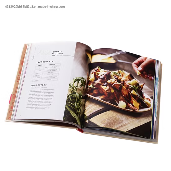
Establish exactly why your project requires a rigid format. Image-driven books like cookbooks, art portfolios, and architectural monographs demand the structural support of heavy boards. These books utilize heavier coated papers that would quickly warp or tear out of a standard paperback binding. Hardcovers support flat-lay spreads, allowing readers to view wide photographs without breaking the spine. Conversely, quick-read, text-only formats often function better as paperbacks. You must justify the upgrade to rigid boards based on how the reader will interact with the pages.
Define the primary use case to align format with function. Image-heavy formats require high color fidelity. They rely on coated stocks that hold ink on the surface for maximum vibrancy. Text-driven formats, such as novels or memoirs, prioritize readability. They require uncoated papers with lower glare to prevent eye strain during long reading sessions. The physical format must serve the content, not fight it.
Identify the primary reading environment to determine the required binding flexibility.
Assess the ratio of text to heavy ink coverage to guide paper coating decisions.
Determine the expected shelf life to select appropriate cover board thickness.
Evaluate the shipping logistics to account for weight and humidity variations.
Establish the target audience's expectations for a premium feel. Tactile and sensory appeal directly influence purchasing decisions. Evaluate how textured materials like linen or cloth compare to smooth printed wraps. A textured cloth cover signals a traditional, high-end collector's item. A smooth, glossy printed wrap signals durability and modern commercial appeal. Your material choices set the baseline for perceived quality before the reader even opens the first page.
Assess the expected wear and tear your volume will endure. Handling frequency dictates your material choices. Reference books, textbooks, and cookbooks face daily abuse. They require high-durability coatings, heavy-duty adhesives, and reinforced hinges. Limited-edition collector's items sit safely on shelves. They can utilize delicate, high-end finishes like uncoated specialty papers or soft-touch laminates that prioritize feel over ruggedness.
Account for environmental factors during shipping and storage. Humidity and temperature variations drastically affect paper moisture content. If moisture levels fluctuate too quickly, binding adhesives can fail. Cover boards can warp outward or inward. You must select materials and adhesives engineered to withstand the specific climate conditions of your target market and storage facilities. Warehouses in high-humidity regions require different adhesive formulations than those in dry climates.
Paper weight directly impacts the thickness, opacity, and drape of your pages. We measure this in GSM (Grams per Square Meter). For standard trade fiction and non-fiction, 100 to 120 GSM offset paper provides the ideal balance. It offers enough opacity to prevent text from showing through the page while remaining flexible enough to turn easily. If you drop below 90 GSM, the text block feels cheap and the ink bleeds through.
Heavyweight requirements kick in when you change trim sizes or add heavy ink coverage. Use 140 GSM offset paper for books under 200 pages up to an 8.5″ × 11″ trim size. This prevents the book block from feeling too thin or flimsy. Opt for 160 GSM offset paper for larger trim sizes. The heavier weight maintains structural rigidity across a wider surface area, preventing the pages from sagging when the book stands upright on a shelf.
You must balance page count against paper bulk. Calculate your PPI (Pages Per Inch) early in the design phase. PPI determines the exact thickness of your text block. If you use thick 160 GSM paper for a 500-page book, the text block becomes too heavy for the binding. This places undue stress on the spine, leading to eventual structural failure. Always match your GSM to your total page count to ensure the text block fits the spine width perfectly.
Paper Type | GSM Range | Average PPI | Best Application |
|---|---|---|---|
Uncoated Offset | 100 - 120 | 450 - 380 | Novels, Memoirs, Textbooks |
Gloss Coated | 130 - 150 | 500 - 420 | Photography, Cookbooks |
Matte/Silk Coated | 140 - 160 | 450 - 350 | Art Portfolios, Illustrated Guides |
Uncoated offset paper absorbs ink into its fibers. This makes it the best use case for text-heavy books. The benefits include high text readability, zero glare under reading lamps, and a traditional tactile feel. The rougher surface scatters light, making long reading sessions comfortable. However, uncoated paper absorbs dot gain, meaning photographs will look softer and less vibrant than they do on a monitor.
Coated paper features a surface sealant, usually clay, that restricts ink absorption. This keeps the ink on the surface, resulting in sharp, vibrant images. Gloss coated paper provides maximum color saturation and contrast. It is ideal for high-end photography. Silk or matte coated paper offers a premium compromise. It provides excellent color depth while reducing the harsh glare associated with gloss, making it perfect for books that mix heavy text with detailed illustrations.
Evaluate paper opacity to prevent show-through. Show-through occurs when ink from one side of the page is visible on the reverse side. This ruins the reading experience. High-ink-coverage designs require higher opacity papers. Coated papers generally offer better opacity at lower weights compared to uncoated papers, but you must always test physical samples with heavy black ink patches.
Print a solid black block on one side of the sample sheet.
Place the sheet over a standard text page under bright lighting.
Measure the visible show-through to determine if a higher GSM is required.
Test the sheet with heavy solvent inks to check for fiber swelling.
The cover wrap is the material glued directly over the rigid greyboards. For printed hardcover wraps, 60 to 75 GSM paper serves as the strict industry standard. This specific thickness allows the paper to fold cleanly over the board edges and tuck into the corners without tearing or creating bulky, unsightly lumps. If you use paper thicker than 80 GSM, it will fight the adhesive and crack at the hinges when the book opens.
Paper wraps offer unmatched printability and customization. They allow for full-color, edge-to-edge cover designs. You can print complex photographic artwork directly onto the wrap. This eliminates the strict need for a dust jacket, reducing overall production costs while maintaining high visual impact on retail shelves. The paper wrap must always be laminated to protect the ink from scratching off during transit.
Textured materials add a distinct tactile dimension to your project. Linen, cotton cloth, and textured specialty papers enhance both visual depth and sensory appeal. Readers associate these materials with premium, limited-edition, or academic volumes. They provide a classic aesthetic that printed paper simply cannot replicate. However, these materials require specialized bindery equipment to handle the thicker substrates.
You must evaluate how different textures accept post-press embellishments. Smooth faux leather accepts crisp foil stamping and deep blind debossing beautifully. Coarse linen, however, can break up the edges of fine foil lines because the foil cannot bridge the gaps in the heavy weave. Screen printing works well on flat cloth but struggles on heavily pebbled textures. Always test your specific artwork on the exact material swatch before approving the run.
Cover Material | Durability | Foil Stamping Quality | Edge Turn-In Cleanliness |
|---|---|---|---|
Printed Paper (Laminated) | High | Excellent | Excellent |
Cotton Cloth | Medium | Fair (Texture interference) | Good |
Faux Leather (PU) | Very High | Excellent | Fair (Requires thinner backing) |
End sheets are not just decorative interior pages. They serve a critical structural purpose. They secure the interior text block to the exterior rigid cover boards. One half of the end sheet is glued entirely to the inside of the cover board, known as the paste-down. The other half forms the first free page of the book, known as the flyleaf. The fold between these two halves acts as the primary hinge for the entire volume.
Material selection for end sheets requires careful attention. They must withstand constant tension every time a reader opens and closes the book. Therefore, end sheets require heavier, durable paper. We typically specify 120 to 160 GSM uncoated woodfree paper. Uncoated paper absorbs the binding glue better than coated paper, ensuring a permanent, secure bond between the text block and the heavy boards. Using coated paper for end sheets often results in the text block tearing away from the cover.
Gloss lamination fundamentally alters the visual impact of your cover art. It enhances contrast, deepens dark colors, and makes bright images pop off the shelf. The reflective surface catches the light, drawing immediate attention in crowded retail environments. If your cover relies on high-contrast photography or bold, saturated typography, gloss lamination maximizes that visual impact.
Beyond aesthetics, gloss provides superior physical protection. It offers high resistance to scuffing, liquid spills, and greasy fingerprints. You can wipe a glossy cover clean with a damp cloth. This makes it the ideal choice for heavily handled books like cookbooks, children's literature, and educational manuals where durability is the primary concern. The slick surface tension prevents dirt from embedding into the cover.
Matte lamination offers a modern, sophisticated, and subdued appearance. It diffuses light, eliminating glare and allowing readers to view cover typography and subtle design details without distraction. The flat finish feels inherently more elegant than high-gloss plastics. Matte finishes are frequently selected for limited-edition versions to elevate perceived quality. They signal to the buyer that the volume is a serious, high-value object.
However, you must manage scuffing risks. Standard matte lamination is inherently vulnerable to scratches and fingerprints. Dark colors, especially solid blacks or deep blues, will show every single scratch and oily fingerprint instantly. This ruins the premium perception you tried to create. The soft surface of standard matte acts like a magnet for friction marks during shipping.
To mitigate this, specifying anti-scratch matte lamination is a mandatory upgrade for dark-colored designs. Anti-scratch matte features a specialized hard-coat polymer layer that resists abrasions while maintaining the soft, glare-free aesthetic. It costs slightly more, but it saves your books from looking ruined after one day on a retail shelf. Always specify this chemical upgrade on your purchase order.
You can combine a matte base laminate with Spot UV or foil stamping to create high-contrast tactile elements. The dull matte background forces the shiny Spot UV or metallic foil to stand out aggressively. This contrast draws the eye and invites the reader to run their hands over the cover. Registration tolerances are tight, so ensure your artwork files trap the Spot UV layers correctly.
If you plan to use embossing or debossing, you must meet strict technical requirements. The cover boards must be thick enough to support deep impressions without compromising the structural integrity of the wrap. Typically, you need at least 2.5mm to 3mm thick high-density greyboard. If the board is too thin or soft, the debossing stamp will punch through the paper wrap or warp the entire cover board permanently.
Board warping is the most common and devastating failure in rigid binding. It comes down to the physics of grain direction. Paper expands and contracts with humidity. The paper grain of the interior pages, the end sheets, the cover wraps, and the rigid boards must all run parallel to the spine. If any of these elements have a perpendicular grain direction, they will pull against each other as moisture changes, causing the cover boards to warp outward like a banana.
Gutter cracking occurs when you use heavy coated papers in tightly bound books without proper scoring. When the reader forces the book open, the thick paper cracks at the spine fold, exposing the white paper fibers beneath the ink. To prevent this, specify Smyth-sewn binding rather than standard EVA perfect binding. Smyth sewing uses thread to sew folded signatures together, allowing the book to lay flat without stressing the gutter.
Laminate peeling ruins the exterior of the book. This usually happens over areas with solid, heavy ink coverage. The lamination film struggles to adhere to thick layers of wet ink due to outgassing. To prevent detachment, you must specify proper curing times. The printed sheets must dry completely—sometimes for several days—before the lamination film is applied. Rushing this step guarantees peeling covers.
Never bypass prototyping. The critical importance of ordering a physical, unprinted dummy book cannot be overstated. A dummy book uses the exact paper weights, board thicknesses, and binding methods you specified, but without the printing. This allows you to test the physical weight, spine flexibility, and material feel. You can verify that the PPI calculations are correct and that the book opens smoothly.
Establish strict proofing standards before mass production begins. Review wet proofs or high-resolution digital proofs for color accuracy on your specific paper stocks. Colors render differently on uncoated paper versus coated paper. Do not authorize the full print run until you have verified that the ink density and color profiles match your expectations on the actual production substrate.
Request a physical dummy book constructed from the exact specified materials.
Verify the spine width accommodates the calculated text block bulk.
Test the hinge flexibility by opening and closing the dummy repeatedly.
Review wet proofs for color accuracy on the actual production substrate.
Check the grain direction of the dummy's end sheets and cover boards.
Calculate your exact page count and match it to the appropriate interior paper GSM to ensure a stable spine width.
Select a cover wrap material and finish that aligns with your expected handling frequency and retail environment.
Mandate that all paper grains for the interior, end sheets, and boards run parallel to the spine in your technical specifications.
Upgrade to anti-scratch matte lamination for any cover design featuring heavy, dark ink coverage.
Order a physical, unprinted dummy book to test binding tension and material thickness before approving mass production.
A: Choose a rigid format when producing image-driven works like cookbooks, art portfolios, or photography collections. Heavy coated papers require the structural support of rigid boards and Smyth sewing to lay flat without tearing. They also command higher retail prices and offer greater long-term durability for reference materials.
A: For standard text-heavy fiction or non-fiction, 100 to 120 GSM uncoated offset paper is ideal. If you are printing a highly illustrated book or a photography portfolio, upgrade to 140 or 160 GSM coated stock to prevent show-through and support the vibrant ink coverage.
A: Choose glossy lamination for high durability, scuff resistance, and vibrant color contrast. It is perfect for cookbooks and children's books. Choose matte lamination for a sophisticated, premium feel with zero glare. However, always use anti-scratch matte for dark covers to prevent visible fingerprints and scuffs.
A: Uncoated paper absorbs ink, providing a glare-free, textured surface ideal for reading long blocks of text. Coated paper features a clay sealant that keeps ink on the surface. This produces sharp, vibrant images and high contrast, making it the standard choice for photography and detailed illustrations.
A: Standard trade volumes typically use 2mm to 2.5mm thick high-density greyboard. For oversized coffee table books, premium collector's editions, or covers requiring deep blind debossing, you should upgrade to 3mm boards to prevent warping and provide a substantial, heavy feel.
A: End sheets are the heavy papers glued to the inside of the cover boards and attached to the first page of the text block. They act as the structural bridge holding the interior pages to the exterior cover. They require strong, uncoated paper to withstand constant opening tension.